Two Rivers Coffee
Two Rivers Coffee is a 20th-century coffee production factory located in Brooklyn. Known for its premier in-person tasting venue, they wanted to bring that rich catalog online so coffee lovers could shop from the comfort of home.
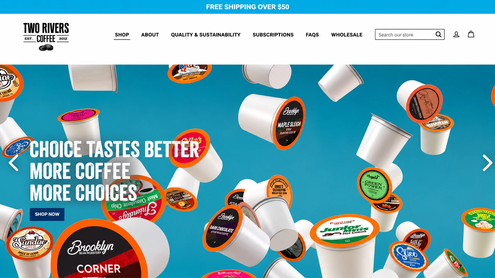
Shoppers loved the Brooklyn tasting room, but buying pods online felt fragmented. So I redesigned all 4 pillars.
D2C Food & Beverage E-Commerce Redesign — Indexing 19 partner brands across 4 end-to-end templates with One-Time and Subscribe & Save options.
Requirements
Major requirements were discussed from stakeholders regarding important points which needs to implemented on website. I have laid down the points below:
Redesign homepage
Hero Carousel & Brand Story
Structured product detail page
Pod Counts & Subscriptions
Proper product listings
Multi-Brand & Type Filters
Add blog page
Category Hub & Reader View
Goals
After properly understanding the requirements, the main goal of the website redesign were eatablished
Homepage
A proper homepage with carousel banners at top and important info needed in homepage.
Product Details
Proper product detailed with counts and subscriptions need to be implemented. Product info and customers reviews will be additional.
Product Listings
All products needs to be listed in one single page with filters. Add all brands under brands filters and products under products filters.
Blog Page
Separate blog page with all different categories needs to be design. One have to be blog page and other blog detail page.
Competitor research
Competitors analysis helps me to understand the trends and best practices in the e-Commerce coffee pods industry. Especially, the ones that help customers receive from online services. It also allows me to understand how our competitors are offering and serving customers. So, my competitor’s research focused on the most popular products in the market, such as MAUD’S, COFFEE FOR LESS EST. 1975., SLEEPY OWL COFFEE
Well structured product detail page with all product info wherein user can choose pods quantity and gift subscription. This give me an idea how to proceed with product detailed page with all the product info which a user is looking for while checking the product.
Coffee and other products are well properly aligned in product list page. Filters like brand, k-cup, price and others are well placed at left hand side. But during the research i found one down side, no product pictures are their in product list page. Which i think is a weakness for them.
Homepage is quite good for any user to check-in and can scroll down for more other products and best selling products. Top clients reviews at bottom makes it plus point.
Design Process
To define user needs and understand different user mental models, I referred to all auction houses research. To ensure the project go smoothly, I communicated frequently with stakeholders and cross-functional partners, and aligned with the Design System team on defining the component; To craft the design solutions, I went to design critique every week and actively asked for feedback from designer inside and outside of our team to iterate my design.
Here is the general process with 3 major stages: think, explore and build.
- 1Design Brief
- 2White-Boarding
- 3Use Cases
- 4Qualitative Interview
- 1Information Architecture
- 2Visual Variations
- 3Interaction Flow
- 1Usability Testing
- 2Rollout Strategies
- 3Cross-team collaboration
Five full-length blueprints before visual polish.
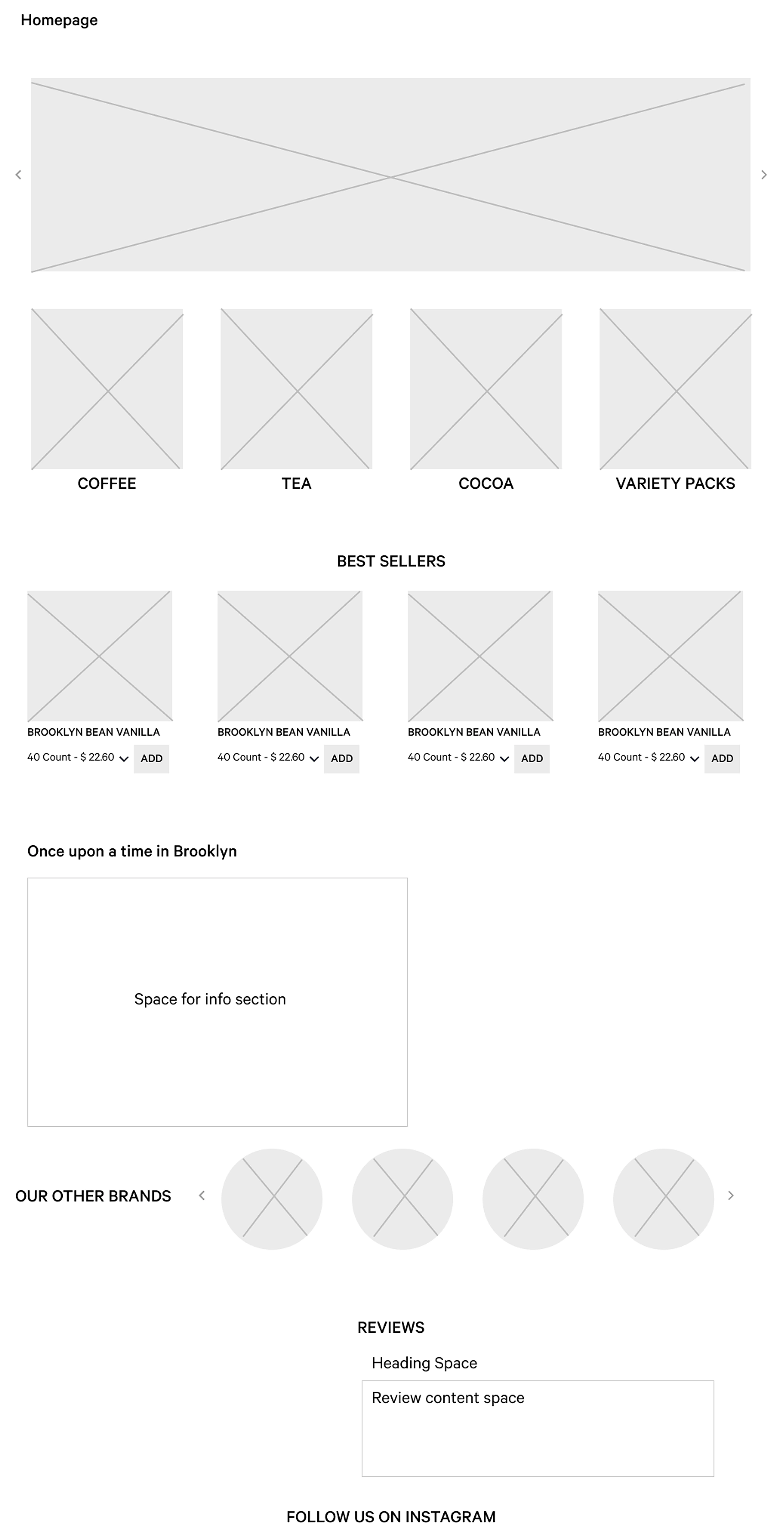
Lo-Fi wireframe was made after brainstormed. The prerequisite were straight forward and i march with the low-fi wireframe design.
Homepage Wireframe
Top carousel banner, 4 core category tiles (Coffee, Tea, Cocoa, Variety Packs), Best Sellers grid with count dropdowns, "Once upon a time in Brooklyn" story block, partner brands slider, customer reviews, and Instagram feed.
Every screen, as it shipped.
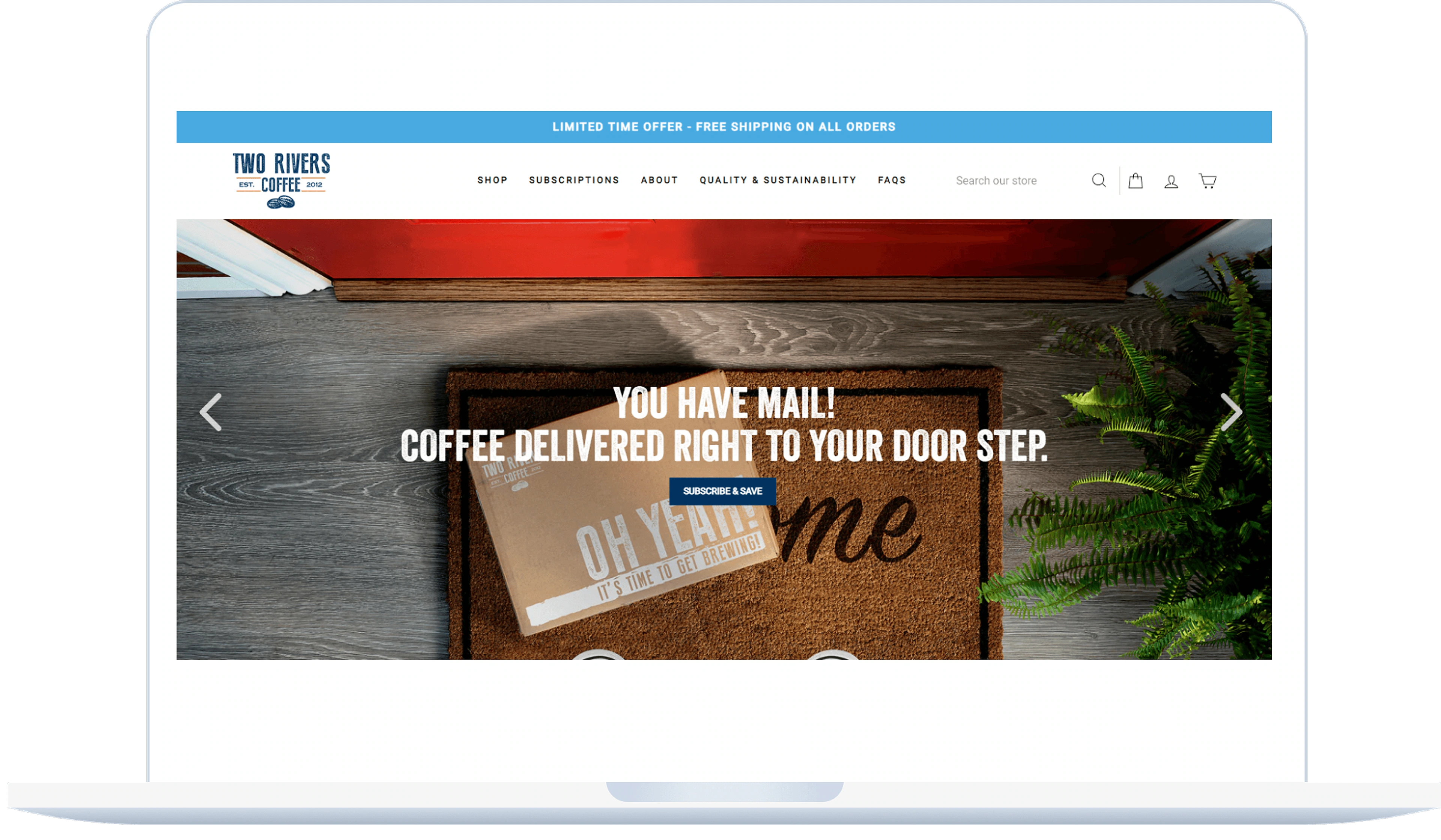
Two Rivers Coffee eCommerce allows users to order coffee and tea pods direct to your home with latest technology.
You Have Mail! — Coffee Delivered Right To Your Door Step
Vibrant product photography paired with clean typography and high-contrast conversion actions.
Four core journeys, live in motion.
Homepage
New homepage design was implemented with all important info and products. Users can now scroll down and explore the world of Coffee pods.
Project Learnings
Keep on Creating Clean UI
As dull as it may seem, UI trends are foreseen not to shock designers by extravagant layout schemes or unrecognizable visuals.
Define your channels
Showcase your process, not just the finished product. Write about the methods you used, what you learned along the way, the challenges you came up against, and how you solved certain problems. Each case study should tell a complete, logical story.